
The Anatomy of an Expensive Looking Face

An expensive-looking face is rarely the result of more makeup. It is the result of better decisions.
The women who always appear refined, even in soft daylight or under unforgiving restaurant lighting, usually share one thing: their makeup has visual polish. Nothing shouts. Nothing fights for attention. The complexion looks considered. The colors sit in harmony. The shine appears placed rather than accidental. Every edge has been edited.
Visual polish is the difference between makeup that has simply been applied and makeup that has been designed. It does not require a full glam routine, luxury foundation, or a vanity full of status products. It comes from proportion, restraint, placement, texture, and finish.
This is where beauty becomes more than application. It becomes elevation.

Expensive-looking skin appears intentional rather than covered
The first sign of heavy makeup is not always cakiness. Often, it is sameness.
When foundation erases every variation in the skin, the face can start to look flat. Luxury makeup, professional makeup, and editorial beauty all tend to preserve some life in the complexion. The skin still looks like skin, only more even, calmer, and better lit.
The goal is not to conceal every trace of humanity. The goal is to decide what deserves coverage and what can remain visible.
That shift changes everything.
A polished complexion usually has three qualities:
It looks even where evenness matters most.
It keeps translucence in the high points of the face.
It avoids a thick border where makeup meets hairline, jaw, or neck.
This is why spot correction often looks more expensive than a heavy layer of foundation. A sheer base over the center of the face, paired with careful concealer only where needed, creates a more elegant result than full coverage everywhere.
The most refined skin work usually happens in thin layers. A small amount of product is placed where redness, shadow, or uneven tone distracts from the face. Then the edges are softened until the correction disappears into the skin.
The under-eye area deserves special restraint. Too much product there can age the face, even when the concealer is expensive. A lighter hand, precise placement, and careful blending at the inner corner usually look more polished than a large triangle of coverage.
The same principle applies around the nose, mouth, and chin. These areas often need attention, but they rarely need thickness. A face looks expensive when the coverage appears invisible at conversational distance.
Visual polish begins when the skin looks cared for, not concealed.
Powder should also be edited. Matte skin can look beautiful, but total flatness often removes dimension. Use powder where movement, oil, or texture needs control. Leave a softer finish on the upper cheek, outer temple, or bridge of the nose if those areas naturally catch light in a flattering way.
The complexion should give the impression of health, not labor.
Blush and bronzer should sculpt the face with softness
Blush and bronzer have the power to make a face look lifted, rested, and quietly expensive. They also have the power to pull the face downward or make the makeup feel unbalanced.
Placement is the difference.
Bronzer should create believable warmth, not a stripe of color. The most polished application follows the places the face would naturally receive sun: the temples, the outer cheek, the perimeter of the forehead, and sometimes the soft edge of the jaw. The product should look like warmth emerging from the skin, not sitting on top of it.
For many faces, bronzer placed too low under the cheekbone can make the face look tired. It drags the eye downward. A more elevated placement, lightly hugging the upper hollow and blending toward the temple, gives structure without harshness.
Blush works in a similar way. The highest-impact placement is often slightly higher than expected. Rather than placing blush only on the apples of the cheeks, blend it upward and outward across the upper cheek. This creates freshness while keeping the face lifted.
The color should complement the lip and the natural undertone of the skin. Expensive-looking makeup often has harmony between cheek and mouth. They do not need to match exactly, but they should feel related.
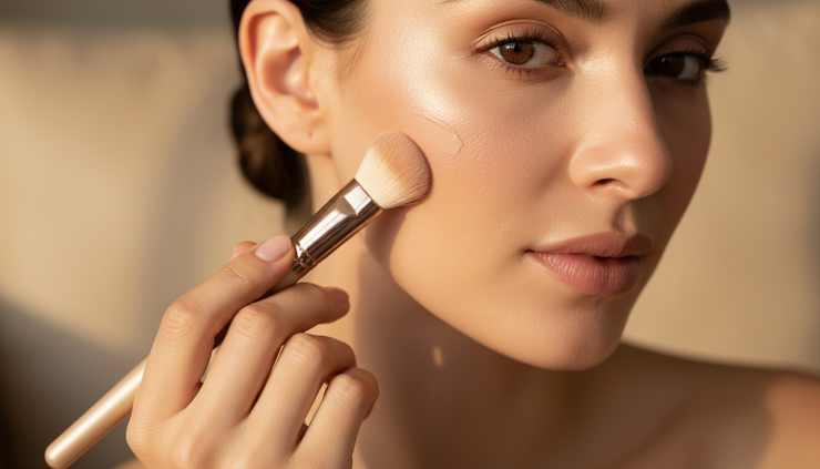
A useful way to think about cheek color is to ask what role it plays.
Does the face need warmth? Use bronzer first, and keep blush soft.
Does the face need freshness? Let blush become the feature, and keep bronzer sheer.
Does the face need structure? Use a muted bronzer or contour shade with a diffused edge, then add only a touch of color to the cheek.
The expensive-looking choice is rarely the loudest choice. It is the one that gives the face exactly what it needs.
Texture matters too. Creams and liquids can look seamless when applied in thin layers, especially on mature, dry, or naturally textured skin. Powders can look equally refined when they are finely milled and blended with care. The formula matters less than the finish it leaves behind.
A polished cheek has no obvious stopping point. Bronzer melts into skin. Blush melts into bronzer. Both melt into the base. That transition is what creates the sense of quiet design.
Precise lip definition gives the whole face structure
A refined lip does not have to be bold. It does have to be intentional.
Lip definition is one of the fastest ways to make the face look more expensive because it creates structure at the center of the face. Even a nude lip looks more polished when the edges are clean, the shape is balanced, and the color sits evenly.
The mistake many people make is focusing only on the lipstick shade. Shade matters, but shape matters more.
A precise lip begins with assessing the natural lip line. Most lips are not perfectly symmetrical, and they do not need to be. The goal is balance, not artificial perfection. A pencil close to the natural lip tone can softly correct shape, define the cupid’s bow, and refine the lower lip without creating a hard outline.
The most expensive-looking lip liner is often invisible as liner. It gives the mouth quiet definition, while the lipstick or gloss blends softly into it.
For a polished nude lip, choose a liner only slightly deeper than the natural lip color. Trace the edge, then soften the line inward with a brush or fingertip. Apply lipstick or balm over it so the mouth looks naturally fuller and more finished.
For a red, berry, or deeper lip, precision becomes even more important. The richer the color, the more visible any uneven edge becomes. A clean lip brush, a sharpened pencil, and a small amount of concealer around the outer edge can make a dramatic color look expertly controlled.
There is also restraint in shine. A glossy lip can look luxurious, but too much gloss outside the natural center can make the mouth appear blurred. Concentrate shine at the center of the lips and keep the outer line more defined.
The face reads as more polished when the eye can understand the lip shape clearly.
Blended transitions are the quiet signature of refined makeup
The eye notices harshness before it notices beauty.
This is why blending is one of the true signatures of elevated makeup. Not endless blending, not muddying every color into one another, but controlled transitions. Each shade should know where it begins and where it ends, while still moving gracefully into the next.
On the eyes, this means crease color should fade softly into skin. Liner should look intentional, not accidental. Shadow should not gather in one heavy patch at the outer corner. The brow bone should remain clean enough to lift the eye.
On the complexion, the transition between foundation and bare skin should be invisible. The transition between blush and bronzer should feel seamless. The transition from jaw to neck should be checked in natural light, not only bathroom lighting.

One of the most common reasons makeup looks less expensive is that each feature is applied separately. Foundation, bronzer, blush, eyes, brows, lips, all technically finished, but not visually connected.
Visual polish comes from connection.
A face looks refined when the undertones are in conversation. Warm bronzer should not clash with a cool gray contour. A pink blush should not fight with an orange nude lip unless the contrast is deliberate. A smoky eye should not compete with an equally intense cheek and lip unless the entire look is meant to be theatrical.
A soft editorial face often uses a limited palette. Taupe, rose, bronze, beige, cocoa, caramel, mauve, or soft berry can be repeated in subtle ways across the face. This repetition creates cohesion.
Even brows need a blended transition. A brow that is too solid at the front can instantly make the makeup look overly done. A more expensive brow usually has structure through the arch and tail, with softness at the inner edge. It frames the face without stamping itself onto it.
Blending is not about erasing the work. It is about removing evidence of effort.
Controlled shine makes the face look lit rather than oily
Shine is one of the most misunderstood parts of modern makeup.
A luminous face can look expensive, fresh, and skin-like. An uncontrolled shiny face can look unfinished. The distinction is placement.
Highlighter should flatter bone structure. It belongs where light naturally lifts the face: the upper cheekbone, the inner corner of the eye, a touch on the bridge of the nose, perhaps a whisper above the cupid’s bow. When it travels too low on the cheek, too wide across the forehead, or too heavily onto textured areas, it stops looking luxurious.
The most refined glow is often satin, not metallic. It catches light when the face moves. It does not announce itself from across the room.
Controlled shine also means knowing where to remove light. The center of the forehead, sides of the nose, upper lip, and chin often need soft control, especially in photos or warm lighting. A small amount of powder or a pressed blotting sheet can preserve luminosity without flattening the whole face.
This is where product placement creates status. The same face can look either glowing or greasy depending on whether shine has been edited.
A polished finish may include:
Satin skin on the cheeks
Softly powdered areas around the nose and mouth
A gentle highlight at the high points
A lip finish that suits the rest of the face
No competing shine on every feature at once
If the eyes are glossy, keep the skin more controlled. If the cheeks are luminous, soften the lip shine. If the lip is vinyl-like, keep the highlighter refined.
Luxury is often a matter of selecting one point of radiance and letting the rest of the face support it.
Restraint is what makes makeup look luxurious
Restraint is not minimalism for its own sake. It is editing.
An expensive-looking face has enough makeup to appear intentional, but not so much that the makeup becomes the main event. There is tension in that balance. It requires skill. It requires taste. It requires the ability to stop before the face loses its ease.
This is why the most elevated beauty education does not simply teach where to put products. It teaches discernment.
Should the skin be matte or satin today?
Does the face need more warmth, or just better placement?
Should the lip be sharpened, or softened?
Is the blush lifting the face, or distracting from it?
Does the shine look expensive in daylight?
These questions create a more refined result than any single product recommendation.
The face becomes expensive-looking when the viewer cannot immediately list the products. Instead, they notice the woman. Her features look balanced. Her skin looks alive. Her mouth has shape. Her cheeks have lift. Her glow has discipline.
That is visual polish.
For women who want to elevate their appearance, this approach is powerful because it moves beyond copying trends. It trains the eye. It builds taste. It turns makeup from a routine into a refined visual language.
If this is the level of beauty education you want, one that teaches elevation rather than mere application, explore the beauty education experience at Lioncourt Studio.
An expensive-looking face does not demand heavy makeup. It asks for intention. Place less, but place it better. Blend what needs softness. Define what needs structure. Control what catches light. Then stop while the face still feels effortless.


Comments